

Ad van Bokhoven, the Dutch painter we introduced in a recent interview, is a master of quick paintings. From ten to thirty minutes, a beautiful pastel or oil landscapes are produced in his studio. Let's look at his painting process together as Ad explains what textures and brushes to use for a lovely quick pastel landscape with majestic skies.
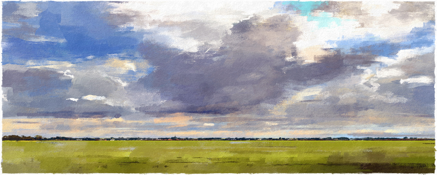
My homeland, the Netherlands is a country of skies. With a beautiful flat landscape, there is a guaranteed spectacular horizon. This is a reason why Dutch skies have always been a motif for painters. In this tutorial, we will look at the beautiful sky from my hometown. Our main medium to work with will be pastels.
As someone who painted countless oil and pastel landscapes, my advice for any landscape painter would be to not try to copy nature, see it as an inspiration! In this case, I made a simple drawing with hardly any detail. This was to show and experience that you can quickly achieve an atmosphere with large surfaces. So, let’s look at it together.
Step 1: Choose the Right Paper
If you read the recent interview that Escape Motions conducted with me, you might already know this. I am a huge fan of the "Banana Rough EX28" texture, which is included in the "Exotic Rough" paper set. The texture has great visibility and it is not too uneven.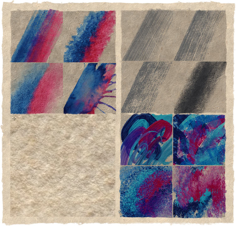
Examples of watercolors, charcoals, and oils on Banana Rough EX28 paper. On the bottom left, example of paper texture with 2000% zoom in.
Then, perhaps the most important choice is the color of the paper. Even more so, it is essential when making a pastel, the color determines the atmosphere and is often visible in 'empty' places.
Choose the color consciously. Unlike white paper, you can paint with 'light' on colored paper. Clearly, an orange on a blue paper will be much more 'violent' than on a white paper!
If you choose a landscape, try to see it through a 'wide-angle lens'. Make some areas smaller to increase depth. Then… well, the color of the paper… guides you through the landscape, and don't be too careful. Choose!! Choose color!
Step 2: Set Up Your Reference
I almost always work with the reference window. What works for me is to have the reference image the same size as the canvas at the beginning. This way it is impossible to think in detail. Choose the largest possible brush and paint colors within five minutes. These are the mood colors that you blend later.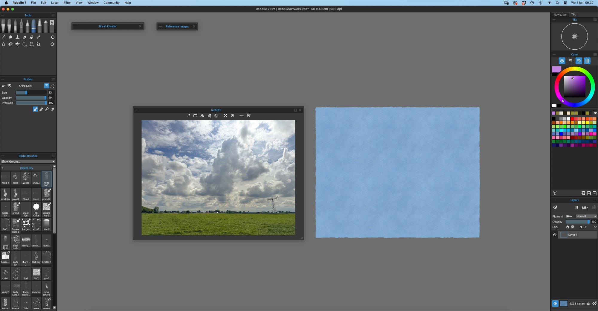
Step 3: Which Brush to Use?
I usually start with a strange pastel crayon. See one of the attachments That piece of chalk gives you space…it is unpredictable and encouraging. In a few strips, different in color, from the same 'region'. At this moment the landscape is already tangible and you already have direction. You can still go in all directions... your creativity needs that space! I will mix those first stripes/colors with the knife tool. Everything becomes a bit softer, a bit more pastel.
Step 4: Organize Your Layers
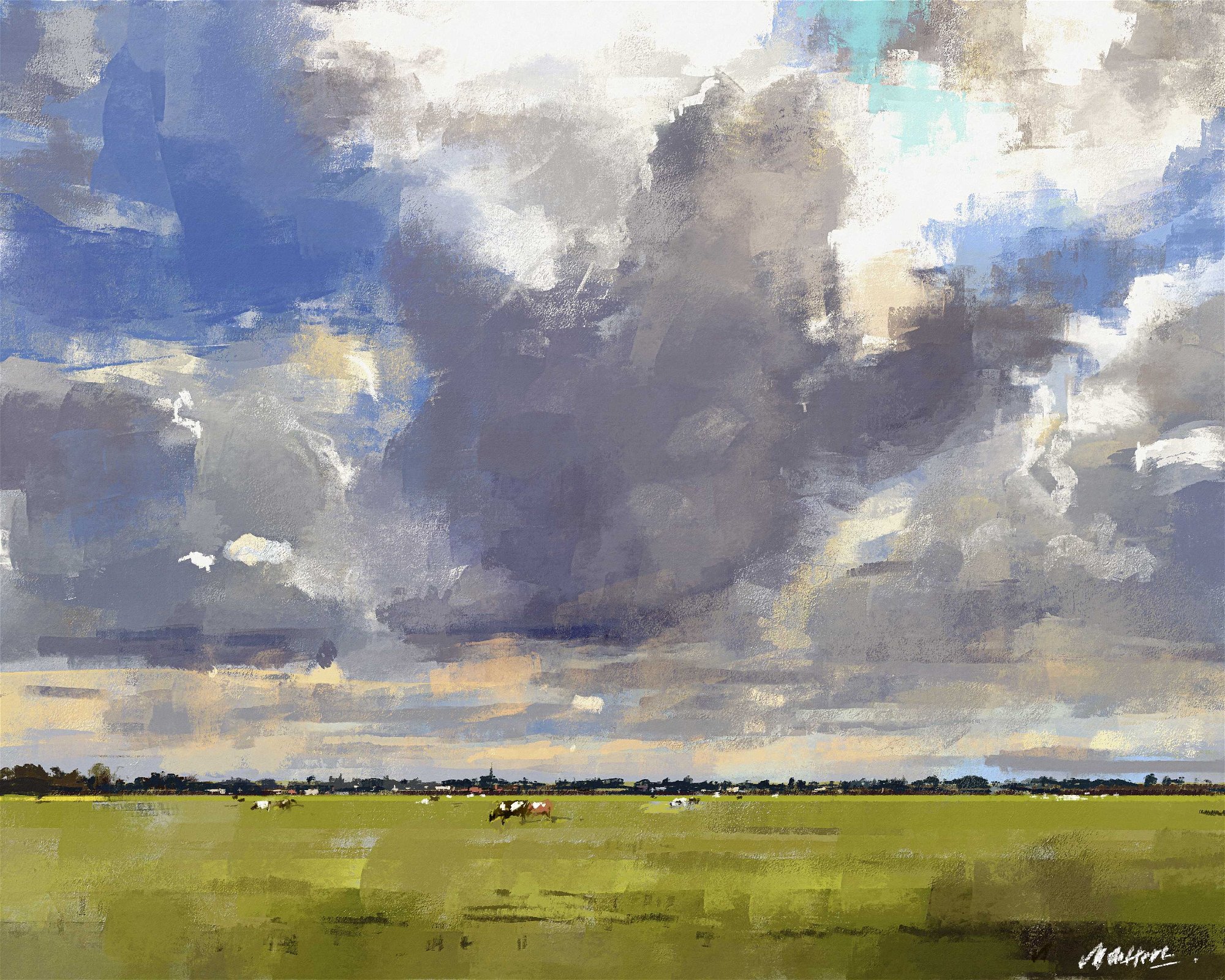
Now on to the sky. I paint the sky behind the village. That is very easy in Rebelle, as an extra layer is created and placed under the village. If I now paint on that layer, I do not affect the first layer (the village on the horizon). The air settles very nicely and easily. Then the foreground. The grass is laid down in just a few swipes with the knife tool; accented here and there with some drawing work. I try not to use more than two brushes in this process.
Step 5: Add an Impression
To finish the painting and give it a point of interest, I add some cows to the yellow fields. In this case, the suggestion is more important than anatomy. So I try to keep it simple, no more than a few simple impressions.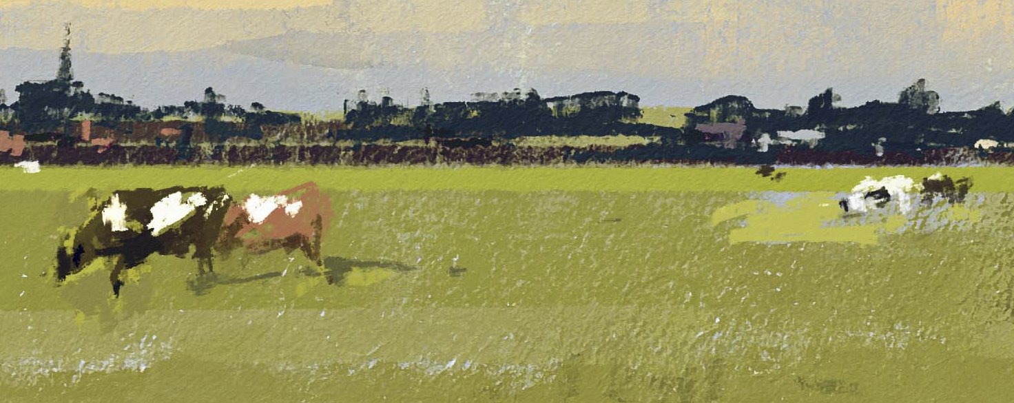
Step 6: Save and Print Out
I often end up exporting my work with NanoPixel Export (x2) and correcting the colors in Photoshop if necessary. This could also be done in Rebelle itself, but I have been using Photoshop for so long that I find it easier. Ultimately, I print my work on an Epson P6000 on 300-gram watercolor paper, and put a mat around it and a simple frame. I hope this helps with your next pastel painting! If you want to use this as a reference for painting with different media, go ahead. I tried that myself and this is the watercolor result.
_______________________________________________________________________________________________________
Thank you, Ad for inviting us to your studio and showcasing your creative process. We hope this pastel tutorial will help you discover the magic of Rebelle's dry media as well whether it will be for a quick landscape of your daily views, such as Ad's, or for any other project you have in mind.
Happy Painting,
Escape Motions Team
-----
Ad van Bokhoven is a Dutch traditional and digital painter. Growing up in the small village of Drunen in south Holland, just a bicycle ride from where Vincent van Gogh once lived, he was drawn to art early on. After graduating from the Royal Academy of Design and Arts in
’s-Hertogenbosch in 1980, he dedicated his professional life to painting oil and pastel landscapes of beautiful views that surround him. Ad took a leap of faith and included new digital painting tools in his workflow in the 1980’s. His digital art keeps a very traditional look to this day.
Ad’s Rebelle artworks: escapemotions.com/user/advanbokhoven/portfolio
Learn more about Ad van Bokhoven: galerievanbokhoven.nl